When you’re looking to start or improve upon a business it’s essential that you have a solid foundation to work with. After close to 15 years building websites I’ve found the following five things are absolutely essential elements for any website no matter how big or small the business.
1. They must work and display well on mobile devices
 This doesn’t mean that your website must look exactly the same, down to the pixel, on all devices. But your site absolutely must function and be usable on desktops, tablets, and smart phones.
According to a recent report, almost one third of global traffic to North American websites in 2013 Q4 came from smartphones and tablets. And that statistic is up 34% from the same quarter in 2012. (Internet Retailer source)
While mobile devices still only account for a fraction of e-commerce sales (~13%) the fact is that more and more consumers are using their mobile devices to research products and companies before making purchases. (Internet Retailer source)
So there’s a good chance that even if you aren’t currently selling something online, a good portion of your customers and potential customers are visiting your site from a device other than their desktop. So having a mobile-friendly website increases the likelihood that they continue to engage with your brand and you can funnel them toward a purchase. Or they find your site doesn’t work or display on their phone and they move on to a competitor whose site gives them what they need.
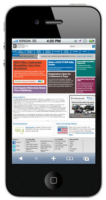
Sure the website in the image above loads on a mobile device. But how long would you spend on it?
2. A Unique Selling Proposition
It’s a shame that businesses often spend so much time and money focused on getting the design of their websites “just right” and not nearly as much time on what the people coming to their websites actually care about: the “what’s in it for me?”
Your unique selling proposition, or USP, is, in a nutshell, the specific benefit the customer can expect to receive by buying your product or why you’re different and better than your competitor.
The reality is that your website has just a few seconds to capture a visitor’s attention and confirm that it can deliver what they’re looking for. However pages “…with a clear value proposition can hold people’s attention for much longer…” (NN/g source). So it’s important that your website immediately and clearly communicates the benefit your product or company offers over the competition.
It’s not super scientific, but there’s a fairly quick way to tell how obvious your USP is. It’s called the squint test and it works like this: take a step or two back from your screen and squint your eyes. Your website will become a little blurry but this should make its visual hierarchy (large versus small shapes and sections) more obvious. With squinted eyes, what attracts your attention the most? Is it an element of your USP or something else? If it’s something else then your USP isn’t the main focus of that page. And that should be corrected as soon as possible.
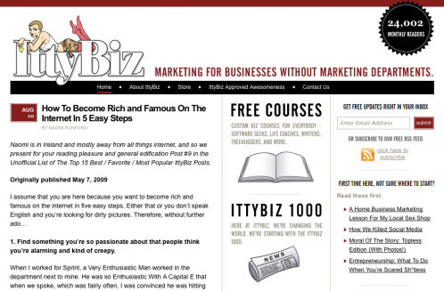
Take a look at the homepage of IttyBiz, the website in the screenshot above. It’s pretty clear right away what that website is about and who it’s for. Marketing for businesses without marketing departments. How clear is it to your visitors what your business does and for whom?
3. A minimum amount of content
One page websites are pretty trendy lately. And that’s ok. But there’s a minimum amount of content and information your business website needs to communicate who you are and what you have to offer your visitors (your USP).
Home
Most anyone who types your business’ domain name into their browser or search will probably end up on your home page. As time goes by other pages in your website get indexed by search engines and people will end up on them from searches. But your homepage will still be the main page through which most people enter your site. So it’s important to make a good first impression. This is where having a very clear USP comes in handy. When people land on your homepage, is it immediately obvious what your site is about? What does your business do? And for whom does it do it? Try to make the answer to these questions as simple and obvious as possible. If your business has multiple products or services the homepage can be a good way to segment visitors accordingly. But it’s important to note that this doesn’t mean the homepage should contain everything the visitor needs to know about each product and service you offer. Cluttered and congested pages can be overwhelming to visitors and cause abandonment. Instead you’ll want to “tease” visitors with only enough information to get them to click to another page which does contain enough information about that particular product or service to convert them into a lead or a customer (these pages are often referred to as landing pages).
The homepage is where a lot of businesses run into trouble. Especially those that have lots of products/services to offer or multiple departments that all want a place on a homepage. When a homepage contains information about every product, service, or department none of them standout. As a side note: this is one of the reasons why homepage “sliders” (multiple images or text that cycle through) are so popular. This is often considered an effective compromise since a single slide can be devoted to each product, service, or department without taking up additional real estate. But this isn’t really effective and actually does each of these stakeholders a disservice. Studies have shown (NN/g source) that most visitors have “banner blindness” when it comes to sliders. That means almost anything animated (with motion) is treated as an ad by visitors and at this point a large part of internet users are conditioned to totally ignore ads.
About
It’s time for a little tough love. Most of your visitors aren’t coming to your website because they really care about you. They’re there hoping you can solve their problems. So while the title of this page is usually something like “About Me” or “About Us” it really shouldn’t be all about you. People will want to know you’ve got the skills and experience to meet their needs but you should try to frame that skill and experience in a way that shows how it ultimately benefits your visitor.
I see a lot of other web designers and developers make this mistake. Their about pages talk about how they know PHP, ASP, MySQL, Photoshop and whatever the latest and greatest technology trend is. But I know nobody hires a web developer because they really want a Ruby on Rails website. That alone doesn’t increase a business’ profits or get them more leads or sales.
To me it’s a given that a service provider would know how to use the tools of their trade. I don’t hire a roofer because they know how to use a hammer. I hire them because the solution they provide (a working roof) keeps the rain out of my house.
This is good advice to remember throughout your website. Always try to focus on the benefits your customer gets from doing business with you rather than simply listing features. Here’s an example from my own business. A feature of web hosting might be enhanced security. A benefit of enhanced security is protecting a business’ credibility by proactively preventing hacking attempts. What do you care about more? The technical details of enhanced security or the fact that your website is safe from hacking attempts?
All that being said, it is helpful to get a little personal on your about page. Every customer is a still a person looking to solve a problem. A people like doing business with people they like. It’s helpful to include a photo of you and/or your team here. Stories resonate even more. So if your company has a compelling story or history, this is a good place for it. Remember that your business’ reason for being or history can be a unique selling proposition also. I am currently working with a client whose business has been serving their city for three generations. Being family owned and operated for over 60 years is enough of a USP for some people to do business with them based solely on that fact.
Services
Hopefully you’ve used your homepage to give your visitors a taste of the products or services you have to offer. If there are a lot or they’re complex and/or have a lot of options it may make sense to break each out onto its own page. Visitors like to scan pages looking for what seems relevant to them. So overloading them with lots of text or options can be overwhelming. It’s also important to remember that the higher the price point of any product or service you offer the more information customers will want in order to make up their minds. It might not take a lot of convincing to purchase a $7 ebook but customers will probably have a handful of questions that need to be answered before forking over $1000 to your company for a product or service.
Contact
Some studies have shown that potential customers will have 3 to 5 interactions with a company before they decide to buy. This can vary greatly however depending on the nature of your product or service.Again, purchasing a simple low cost product will probably require fewer interactions than a more complex higher dollar value one. So how easy is it for potential customers to get in touch and do business with you?
If you want to encourage phone calls, is your phone number placed prominently on every page in your website? Some strictly online businesses don’t want to encourage phone calls. In that case, is there an email address or contact form for customers to use? Is there a forum where customers can ask questions? Is it obvious that it’s monitored and active?
Nothing is more frustrating for a customer who is ready to buy than submitting a form or sending an email to a company and wondering if and when you’ll ever get a response.
The Most Desired Action and the Call to Action
Regardless of what page on your website we’re talking about, you should always be creating it with a most desired action (MDA) in mind. We’re not building a website just for fun and our visitors aren’t reading it just for fun either. Everything we do should have some element of strategy behind it. When we create any content for our website, what is the action we want it to motivate the visitor to take?
Your content strategy can be completely commercial, like motivating a visitor to buy a product, or more altruistic, like simply to inform them on a specific topic. But either way, you should be writing it with some goal or action in mind.
If the most desired action is somewhat subtle, like the dissemination of information, then your call to action will probably be equally subtle or possibly nonexistent. But if your most desired action is more concrete, like buying a product or filling out a form to become a lead, then your call to action should be obvious and clear.
If your content is designed to encourage the visitor to purchase your product then it should lead them down a path where the obvious conclusion is purchasing that product. (Think large obvious button that says “Purchase Product” or “Add to Cart”.)
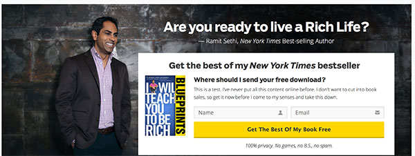
The image above came from the homepage of author Ramit Sethi’s I Will Teach You To Be Rich website. The call to action here is obvious. He’s put it in a giant yellow button that entices you to get content from his book for free. What do you think his most desired action is for this page? He wants visitors’ names and email addresses. Because he knows what we’re going to talk about next…a list is one of the most valuable assets any business can have.
4. A newsletter signup form
Please read this section closely. And then read it again. When I hear about almost any wildly successful online business, the single most common asset they attribute their success to is their email list. Jeff Walker, the author of The Product Launch Formula, described his business’ list as “a license to print money”. And it has earned hundreds of thousands, if not millions, of dollars for his business.
Please don’t misunderstand me though. I’m not suggesting you should look at your list as a cash register to be rung whenever you want to generate some revenue for your business. The value you get out of your list comes from the value you put it into. Jeff regularly emails his list valuable (and free) content. His readers know he knows what he’s talking about based on the value that he provides to them through his newsletter. So when he does have a product or service he wants to sell, they’re eager and willing to buy it.
Hopefully you remember when I mentioned that it can take 3-5 interactions with a company to turn a prospective customer into a paying customer. The single best way to do that is by regularly communicating with them through your list. Providing your list with value on a regular basis can help create a relationship of authority and trust that can relieve a lot of objections when it comes time to make a decision about doing business with your company.
It’s also never too early, or too late, to start a list. Products, services, and even whole businesses can be created out of thin air from a list. Want to know exactly what problems your customers are having and what they’d be willing to buy to solve them? Just ask your list.
5. Good quality and relevant images

Have you seen the woman above? There’s a good chance you’ve seen her or someone who looks like her on many websites’ contact or customer service pages. In another life when I designed lead generation forms for colleges and universities, our team had a library of stock photography to utilize for the variety of occupations our clients provided training for. After just a few months at that job I started to see the faces from those images everywhere from other websites to magazine ads to billboards.
Stock photography is considered a quick and cheap way to get images for your new website. But generic stock images are generally a terrible idea. You want a website that sets you apart from your competition and helps reinforce your unique selling proposition. But the quickest and easiest way to blend in with everybody else is by using the same images as everybody else.
Lucky for normal mortals like us, designer Nathan Barry has published a wonderfully comprehensive article with video tutorials on finding free to low cost images and quickly customizing them to create killer graphics for your website and blog.
6. BONUS! Testimonials, case studies, and social proof
While these things aren’t necessarily required on a website, they can certainly help ease objections. Visitors are coming to your website because they have a problem they need solving. Testimonials, case studies, and social proof can help them imagine a future for their business where you’ve solved that problem. Reading a case study that’s relevant to my particular business problem can help me visualize how your business has the product, service, or experience to solve that problem for me.
Social proof is the psychological phenomenon where people assume the actions of the group. To illustrate this concept, imagine you have a choice between two restaurants. You can see that while there are no cars in the parking lot of one of the restaurants, the other appears to be quite busy. Most people would assume in this case that the busy restaurant is busy because it’s better. All of those people at the busy restaurant must know it’s better. That’s social proof and it’s something we can leverage on the web. In fact you see it in action whenever you see a Facebook fan box on a website. You probably see that some of your friends like something and think there’s a good chance you’ll like it too.
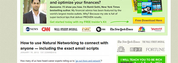
Look at all the media outlets where author Ramit Sethi has appeared (above). He features them prominently in multiple places on his website. Do you think people think a guy who has been on ABC News, CNN, The Wall Street Journal, FOX News, and The New York Times knows what he’s talking about? You bet they do.
The best way to get a testimonial from a customer is to simply ask. Make it part of your follow-up process after you’ve delivered a product or service. This follow-up is likely something most of your competitors aren’t doing so it immediately sets you apart. Positive reviews can be turned into testimonials and any negative ones are an opportunity to improve and do better next time.
The “Back to Basics” series
Hopefully you found the information above useful. Next up in my “Back to Basics” series of actionable advice to grow your business online is a comprehensive look at how to increase the traffic to your website. Sign up for my newsletter below to get notified as soon as that’s published.